How To Choose The Best Wall Color For Your Rooms
Why do we find one place appealing and feel uneasy in another? Why are we attracted to one color over another? Well, color accounts for 60 percent of our response to a place or an object.
“Color psychology” examines the ways colors affect us physically and psychologically.
The significance of color, however, is often underestimated, especially when it comes to its use in our homes and in the places we work.
Color can be such a powerful tool for transforming a plain space into a warm, calming, inspiring, or simply beautiful environment. Choosing the best colors for your home or your office is such an important aspect of improvements and renovations.
When selecting a color, consider the mood of the space you want to paint.
Here are some useful tips from Barbara Jacobs, HGTV:
If it’s a bedroom – do you want it to feel restful and soothing, or exciting and romantic? Soft, cool colors and neutrals typically create a more serene feeling, while stronger, bolder colors create the “drama” effect.
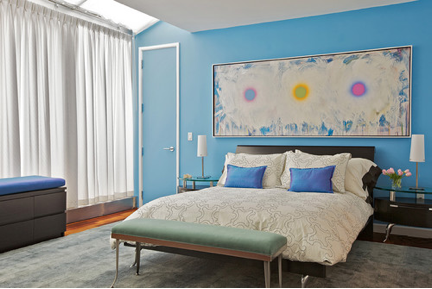 Design by Marie Burgos Design
For your dining area – do you want it to feel inviting and stimulating or more formal and quiet? Warmer, contrasting and brighter colors can create a more hospitable atmosphere; deeper blue-greens and neutrals will provide a more formal ambiance.
For the kid’s room – is your goal for the room to inspire an active and exciting energy, or an organized and restful feeling? If you use intense, bright hues, your kid(s) may become over stimulated, as some brighter colors could lead to unrest and irritability.
To create a more active space, consider selecting bolder, more intense colors, slightly more saturated than off-whites or light pastels. Colors that are really light can feel bright and stark when they are on all walls in a room. At the same time, two or more medium-light, similar pastel colors in the same room can create a luminous effect.
To make a small room seem more spacious – use light colors.
For an open floor plan – select a self-contained wall to paint with an accent color.
For your office space – “White doesn’t help us be productive, and most work environments are white, off-white, or gray,” says Kwallek, Ph.D., professor and director of the interior design program in the School of Architecture at the University of Texas. She suggests the sterile quality isn’t beneficial for work and productivity.
Blue, especially aqua, seems to be a good choice for office space. Also, blue-green is conductive to a work environment.
As far as different types of personalities, colors can affect different people in a different way. Let’s take a look at how:
For detail-oriented – red, a powerful color, stimulates the pulse and can raise blood pressure. A study by the University of British Columbia (UBC) found that red color tends to help increase performance in employees who have detail-oriented assignments.
For creative types – blue, a calming color, promotes communication, trust, and efficiency. It also helps creative people by opening their mind to new concepts. Blue would be a good color in an office space used for brainstorming and creative work, suggests the UBC study.
Also, just like in your home, colors should be considered based on the purpose of the space in your office.
Conference rooms – avoid yellow. It’s the color of optimism, and very stimulating; too much of it, though, can cause anxiety. Studies have shown that people are more likely to lose their temper in yellow rooms, which makes it a poor choice for conference rooms.
For offices where innovation is a key – green. Similar to blue, green is a calming color that promotes harmony and balance, and inspires inventions and innovation. It also can promote creative performance, according to a study published in the Personality and Social Psychology Bulletin.
To keep morale up in office spaces – avoid gray. Although psychologically neutral, color grey is suppressive and prepares people for hibernation, and definitely lacks energy. According to Colour Affects, a London-based color psychology consultant, heavy use of gray can promote a lack of confidence and even depression. It should be used in small amounts in an office and balanced by a brighter, more cheerful color, such as red or yellow.
Also, consider different paint finishes and textures on different walls, especially for your home.
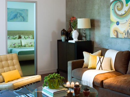 Design by Lori Dennis
Since color choices are ultimately and undoubtedly subjective, when it comes to decorating your home, think about what color palette feels right to you, what best suits your style, personality and environment. Also, remember to factor in lighting. Natural light will show the truest colors during the day. Artificial light affects the look of color throughout a room, depending upon the types of lighting fixtures and bulbs used in the space.
At the end of the day, we all respond to colors in our own way. But you should probably paint over that white wall!
Now, if you feel overwhelmed when it comes to choosing paint colors for you home or office, you are not alone. With thousands of available color options and styles to choose from, not to mention factoring in the light, fixtures and furnishings – painting may seem like a rather daunting task!
We understand the importance of having the right colors in your living and working space, as well as the challenge of selecting the right one and doing the actual painting. Whether you need painting for your home or commercial painting in Lancaster PA, we are here for you!
No job is too small or too cumbersome for our contractors in Lancaster PA area. At Home One Services we’ll help you with anything from painting walls to floor installations and repairs, and so much more – we are here for your home and your business space.
Call us today at (717)581-3474